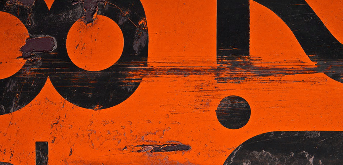
With a new year comes new design trends. Let’s all rejoice at this because seriously…who is getting a little tired of looking at single-colored, flat illustrations? 2018 is off to a great start and it is the year we can expect to see exciting experimentations in color usage, typography and layout. Let’s take a look at exactly what design elements might be popular trends for this upcoming year.
1. Bold, bangin’ color schemes
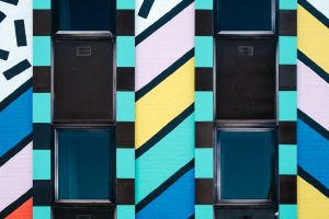
Bright colors that are eye-catching and daring are sure to be conversation-starters for 2018. With the bare-white + Helvetica look dying down, designers are embracing colors that stand out and have more personality. After all, color is a design element that has a great deal of impact on human emotions. It can affect our decision-making and whether or not we choose to buy specific items—something an advertising agency takes into careful consideration. Successful brands always strive to differentiate themselves from competition, and utilizing vibrant color palettes is the perfect opportunity to do so.
2. Simplified but meaningful brand assets

We are seeing an age of design that is getting more and more distilled. This means that brands have increasingly become more interested in streamlining their core assets in order to improve their holistic brand experience. User experience (UX) is an integral part of this brand experience—and in order for UX to be fluid, design systems can’t be too complex or clunky. This is where simplification flourishes. The trend towards packing more meaning into simple, functional designs has grown and continues to spark dialogue regarding the fundamental elements in a brand.
3. Hand-drawn renderings
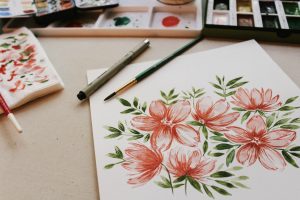
In terms of branding and marketing, nothing is comparable to having a personal touch. There is a special human element that resonates in hand-drawn illustrations and lettering that is not present in cold, computer-generated content. Designers are moving away from technical and polished methods to more organic and hand-crafted approaches. Perfectly refined designs are beginning to feel too dull and fake—consumers are now looking to invest in brands that feel more thoughtful and relevant.
4. Bursts of three-dimensionality
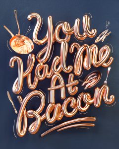
Work by Ben Fearnley
Breaking from the overdone flat design trend is 3D modeling. We’re looking at a whole new perimeter for traditional graphic design that involves shadows and lighting effects. There is something very refreshing and exciting about seeing products, icons and typography pop out from their 2D confines in a new-age manner. Utilizing volume and dimension in design allows brands to create bolder and more unconventional work that sets a new bar for the industry.
5. Serif and sans-serif type combos
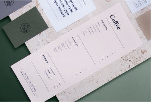
Work by Agata Jeziurska
The digital world has seen a dominating usage of sans-serif typography. With its clean and easily legible appearance, its understandably hard to deviate from. But 2018 is the year to break protocol—to use traditional elements in untraditional ways. Both print and digital advertisements have begun to bring more serif typefaces into the mixture to create charming typographic pairings. Modern bold serifs are especially popular and reminiscent of print advertising’s golden age.
6. Eccentric patterns
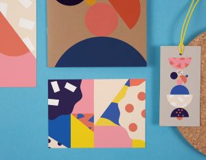
Work by Lilly Friedeberg and Ann-Christin Euler
Quirky patterns with geometric influences have been all of the rage lately and there’s no escaping it in 2018. It’s undeniable that well-made patterns can upgrade a brand’s appearance from boring to fun in one glance. In the last few years, designers have gotten more creative with pattern generation and usage, figuring out how to use them in innovative ways. It is an exploration in pushing boundaries and it doesn’t seem to be stopping anytime soon.
7. “Color transitions” AKA gradients
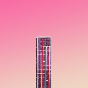
To create more dynamic appearances, industry leaders like Instagram and Stripe began to use vibrant color transitions in their branding. What has followed is an immense return of the old-school gradient used across various industries. We’re talking about gradients being utilized in many aspects of branding, including: logos, landing pages, social media posts, etc. Nowadays, color transitions are evolving to be less gradual and more sharp—there seems to be a growing interest in abrupt and striking transitions of color.
8. Duotones with a twist
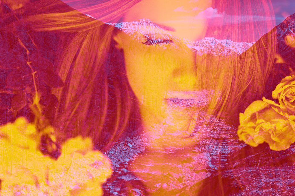
Work by SparkStock
Duotones originally stemmed from duotone prints, which were created by manually overlaying 2 colors in the printing process. Now, in digital media, the concept is being pushed further by combining duotones with double exposures—a photographic process that superimposes images to create one single image. The results are stunning and dynamic visuals that seem surreal. This trend can make a strong statement for brands, giving an edgy and modern vibe off to consumers.
9. The “no grid” grid
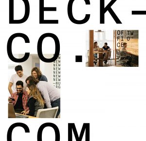
Work by Ariel Di Lisio
Grids, though useful, can sometimes be too strict and stiff. Contemporary designers seem to be interested in being a little bit more loose and free with their work. Unconventional grids are becoming more and more prevalent and the definition of what denotes a successful layout is changing. There exists a desire to break from traditional layouts and and explore new ways of organizing content. From overlapping text to cutting off images, designers are beginning to adhere to their own rules.
10. Engaging microinteractions
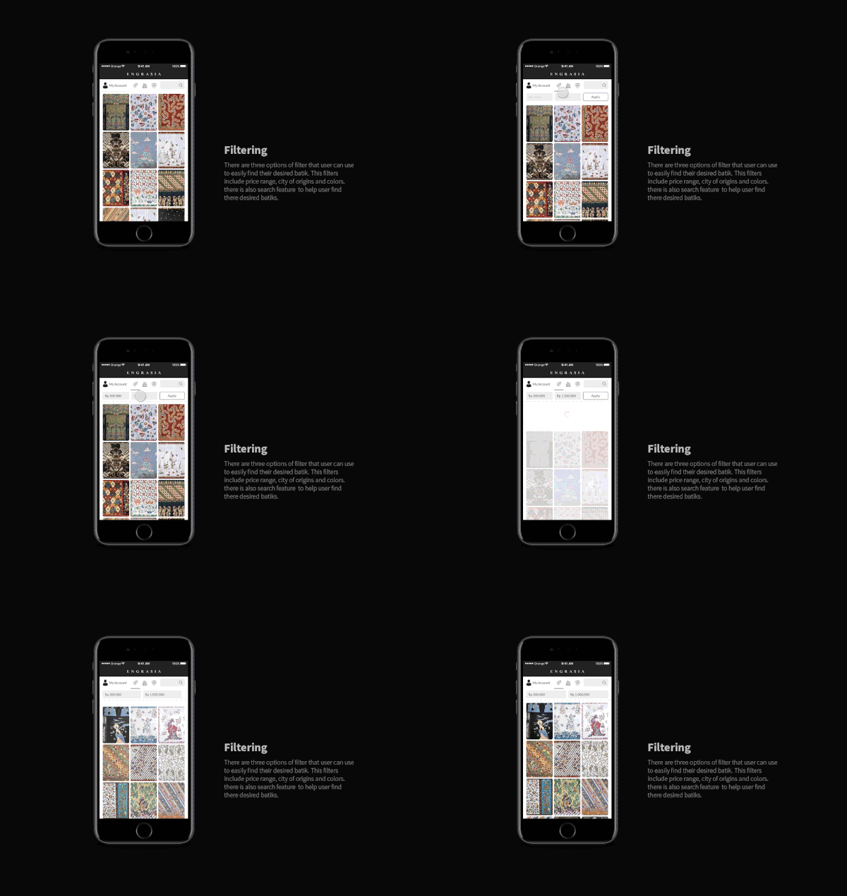
Work by Riyadhi Rachman
Microinteractions are small details that are key in creating a captivating UX. It’s the little animations that follow actions like clicking a button or dragging an item that enhances UX and helps users to understand and navigate tasks. The more engaging a design system is, the more users will enjoy the experience and connect with the system.
At Mellonaid, we can’t wait to see how these 10 trends will be utilized in the design industry. Every year, we see design trends transform and change, inspiring new innovations and ways of thinking. Keeping up with these trends allows us to not only create relevant work, but also encourages us to be unique in setting trends of our own.


